March 23, 2020
Newsletter
Since everything that has been going on, my work has shifted to mostly customer service. This week I recently had some work come up design related. I was asked to work on the website a little more after some feedback, and I also worked on the layout and UI design for the map tool in the app.
Map Tool APP UI
Some of the specific things that I was asked to work on included figuring out a better work flow from the bid to the map tool. Similar to what was done on the desktop portion of the software. I started by getting a layout and then figuring out how the user would interact with the software.
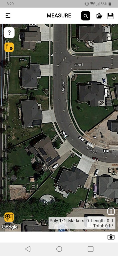
This is the current map tool. The buttons are hard to understand and it is really tricky to use. I have spent a lot of time trying to teach clients how to use this and I can never really get it to work properly. So besides the integration of the tool to a bid, I was also asked to work on the button UX and figure out how to make this more simple to use.
Below are images of my initial approach to the problem. I thought of getting rid of the tools, and making everything into buttons with pop up tabs that would close while working in the map. There were a couple of issues, and after speaking with many people, we decided that having pop up windows that covered the screen would make this to hard to use. We decided to make them into tabs instead and bring back some other simple tool icons.
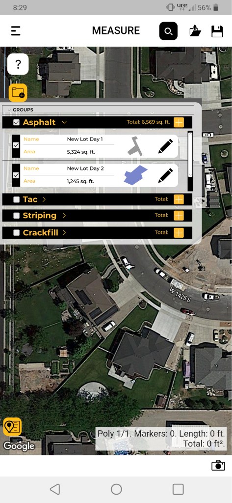
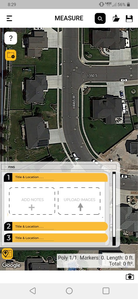
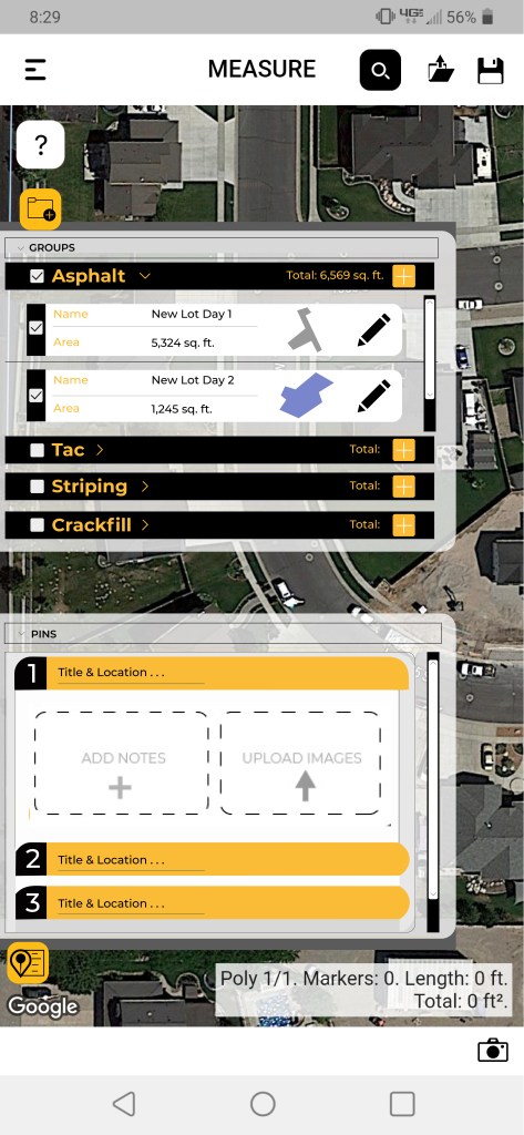
My next approach was to make the tabs, and figure out how the tool would integrate into a bid. I also am showing here, how the edit menu would appear below the area info, this makes it easier to edit the name, colors, and other info.
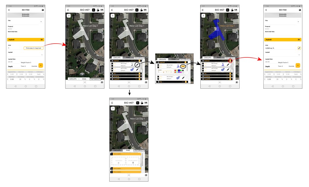
The next thing that I to work out was how to simplify the tools. Originally, there were three separate buttons to start mapping, close and area, and make the area subtract. It was confusing and not very intuitive. My approach to this was pretty simple. I asked many people to help and use the tool to figure out where the struggle was, and most of the time it was in trying to figure out how to close the area. So I came up with a way to click on the the first point mapped out as a close/finish icon. This makes it way easier to understand.
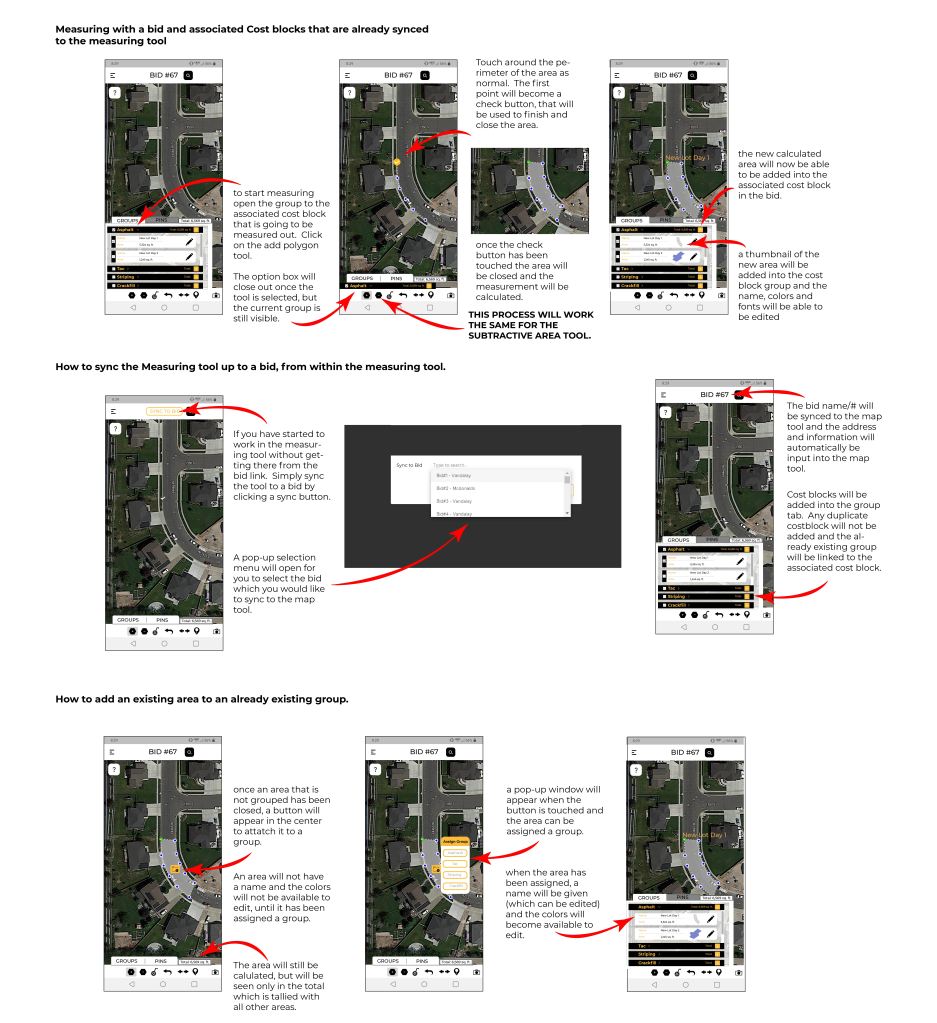
A couple of other issues I had to address were how to sync the map to a bid if someone were to open the map tool from not a bid, and how to attach a new area to a group so that it can sync to the bid.
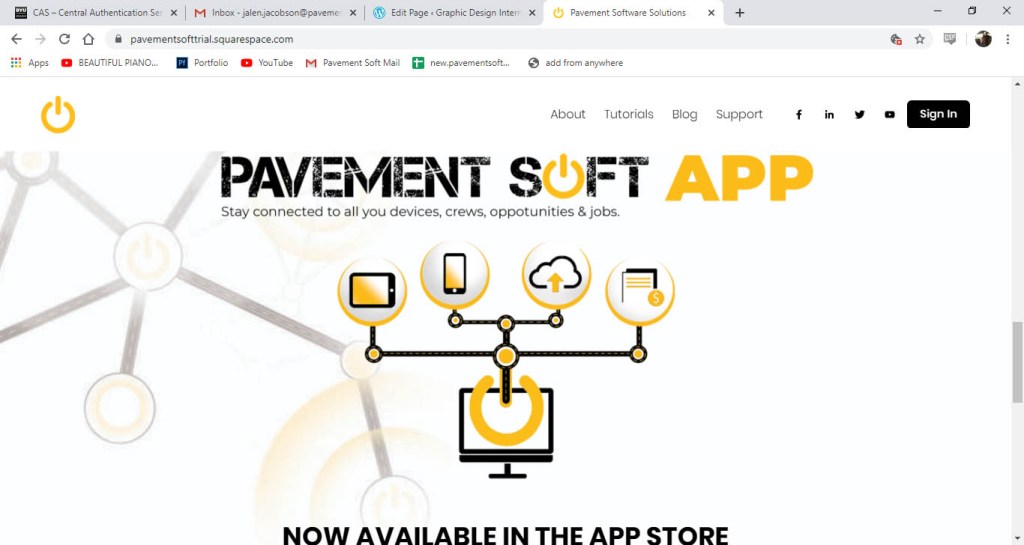
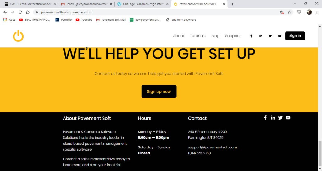
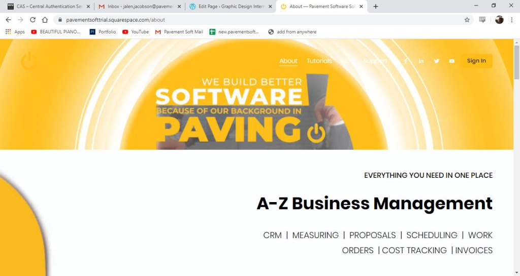
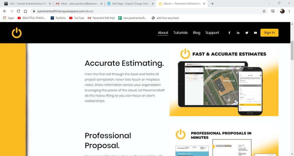
Website Update
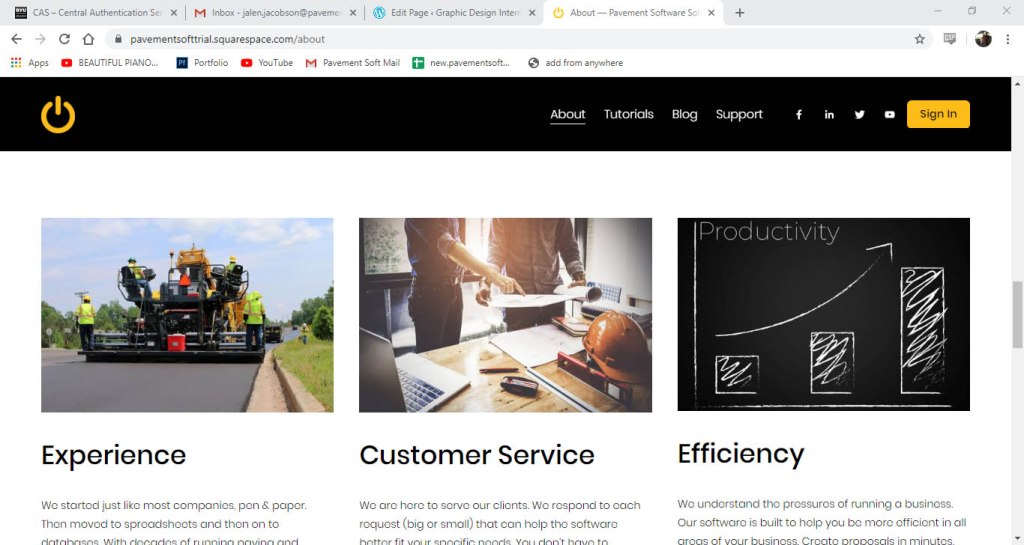
For the new landing page we wanted to make it less wordy and move a lot of the information into the about page. We also needed to make it feel more geared toward the construction industry. This is how I addressed the landing page.
Most of the info was moved into the about page and so I had to create a new layout to put all the info blocks. This is how the current about page is laid out.
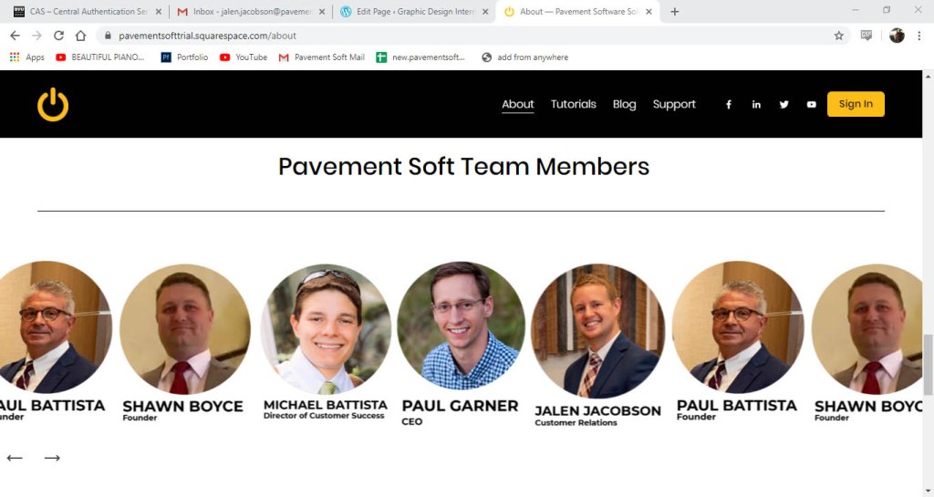
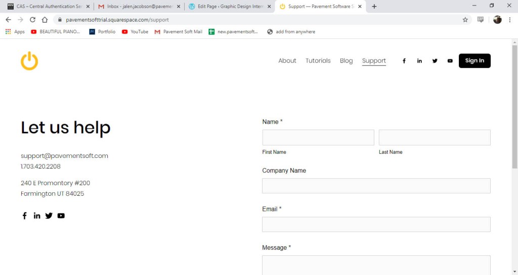
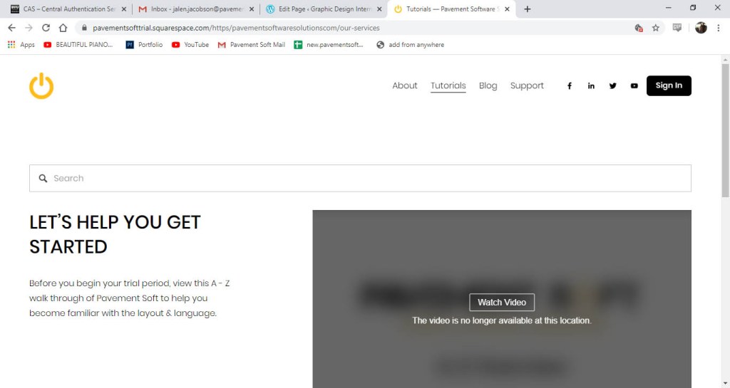
I also updated the rest of the website and finished adding the other pages and filling out the content. These pages include a support, tutorials and blog pages.